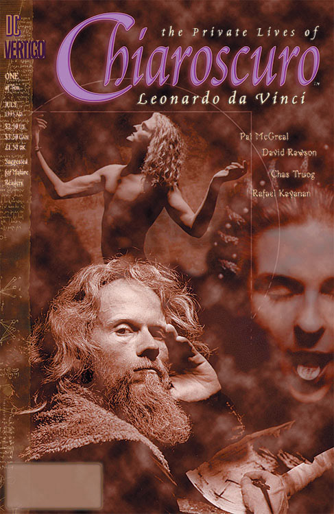
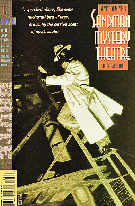
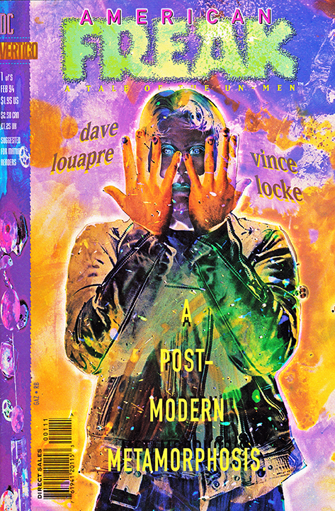
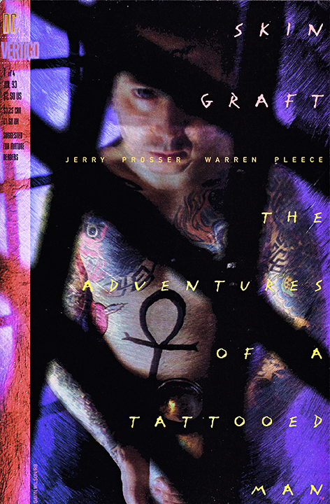
These are covers where I was primarily responsible for layout & design, photo manipulation and the logo.
Photographers I collaborated with include: Sandman Mystery Theatre & Skin Graft w Gavin Wilson, American Freak w Stan Gaz, Chiaroscuro w Stephen John Phillips.
All covers copyright their respective owners (which ain't me).
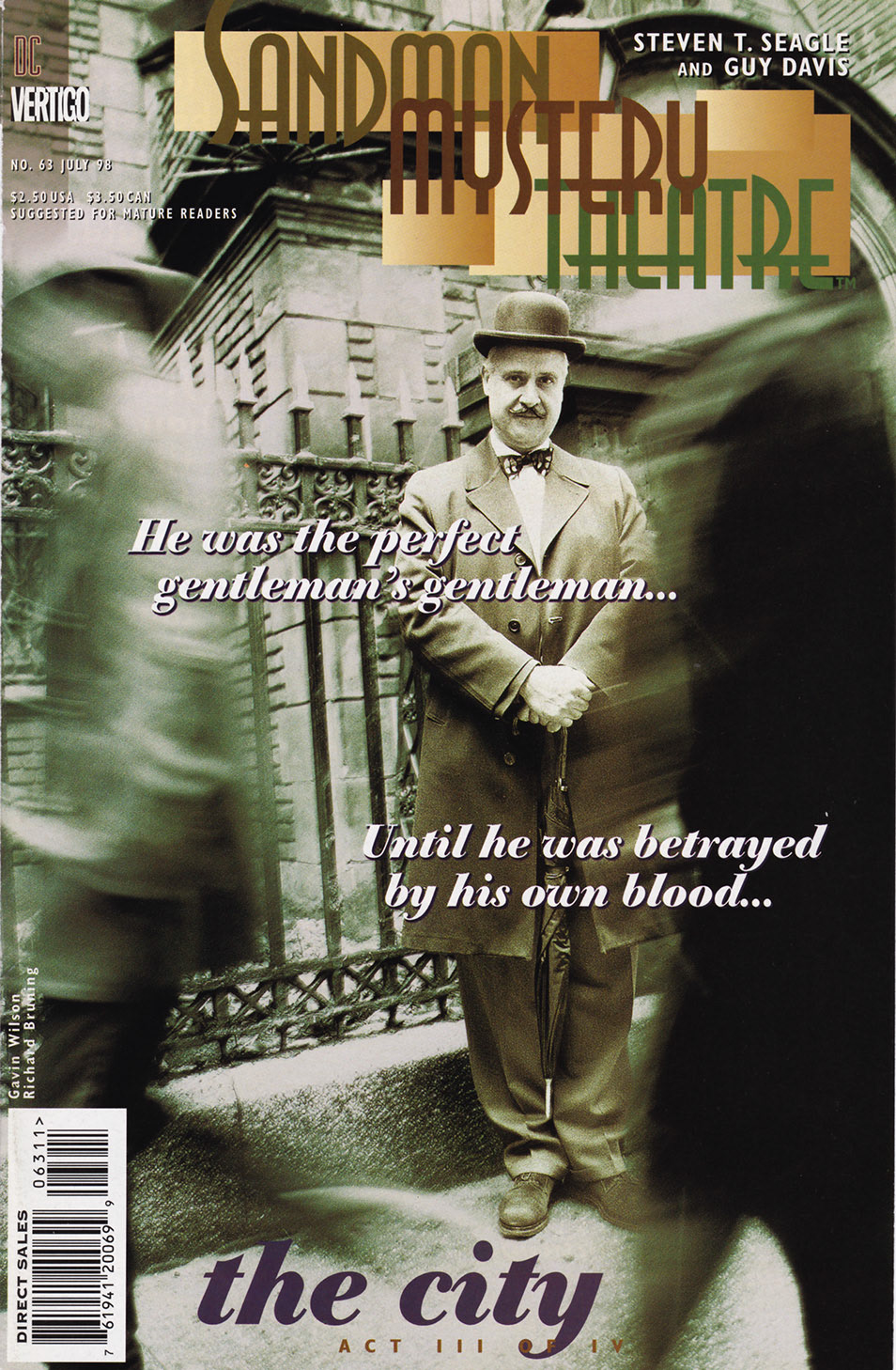
SANDMAN MYSTERY THEATRE #63
Vertigo
Another personal fave. A different aesthetic, fantastic photo, cool logo, great color palette, fun type - it's got it all.
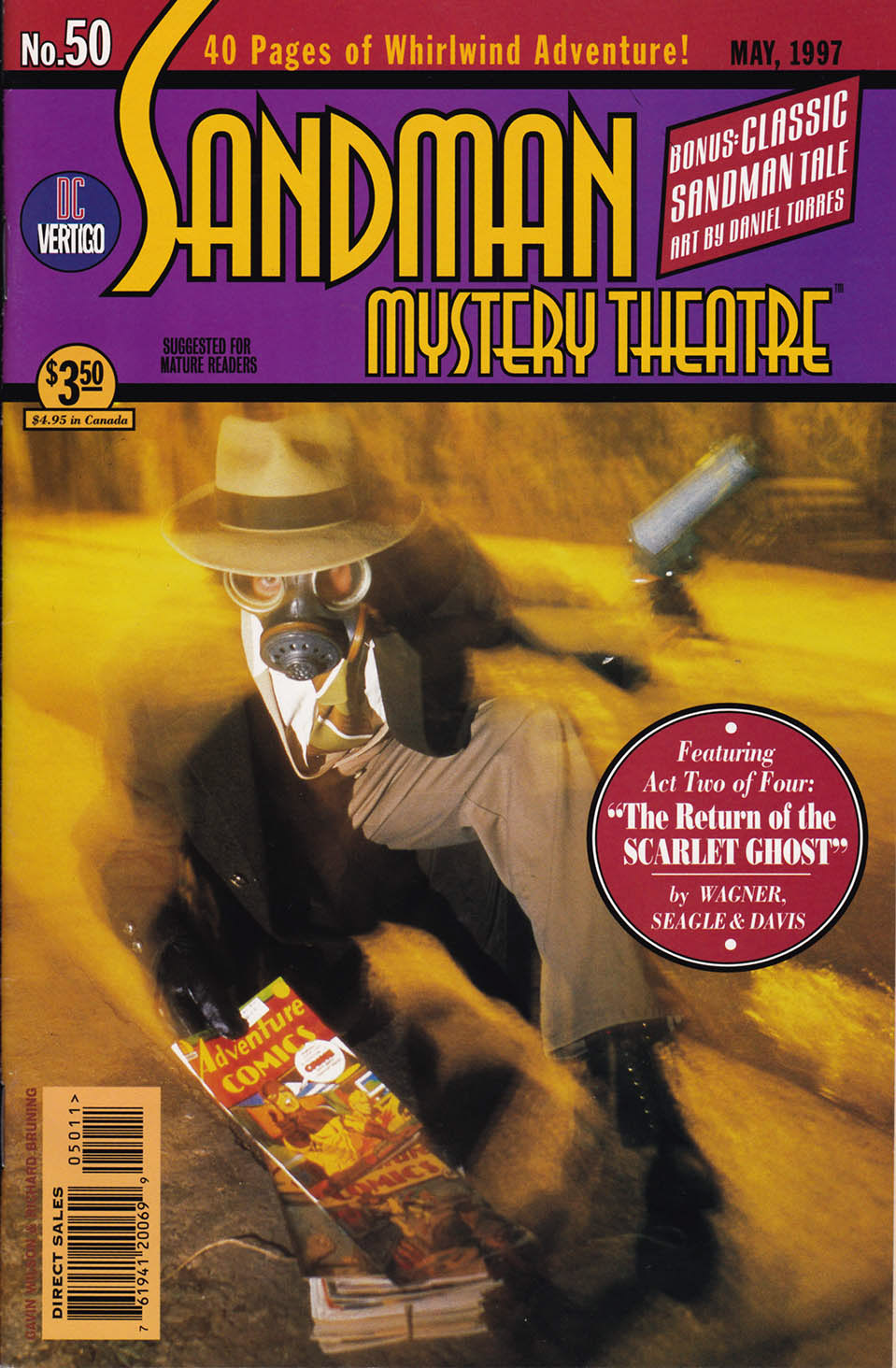
SANDMAN MYSTERY THEATRE #50
Vertigo
I loved doing the type research necessary for a period piece. I did point out to DC's Production Dept that they were messing up the authenticity of the motif by making me put a UPC box on the cover… harumph!
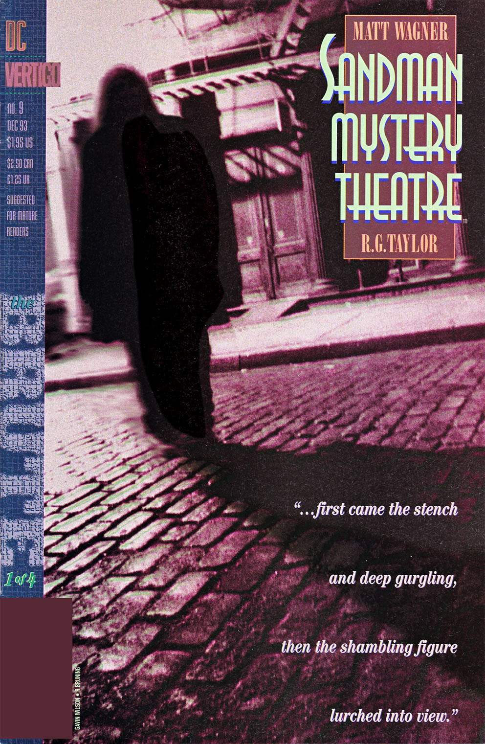
SANDMAN MYSTERY THEATRE
Vertigo
One of the many covers I did with photographer Gavin Wilson (though he's much more than just a photographer).
This example shows how I built the Vertigo info sidebar to be able to have complimentary pieces of art or texture. Unfortunately, getting everyone who was working on laying out Vertigo covers to be that ambitious wasn't so successful. Ah well…
I could do a whole section on these covers, and I may someday.
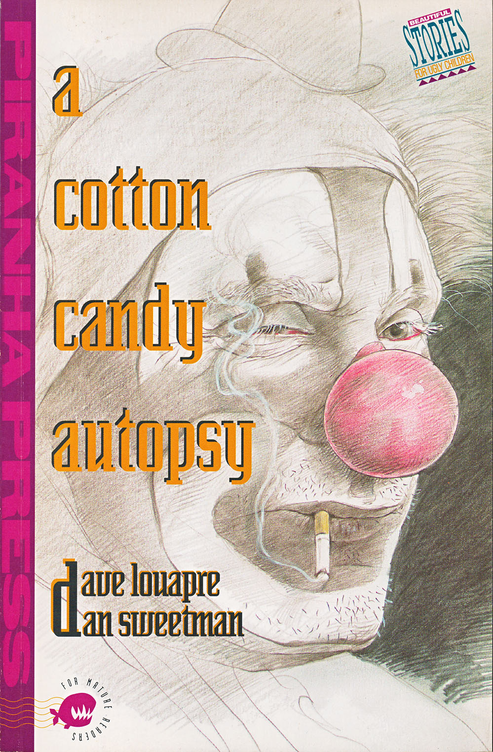
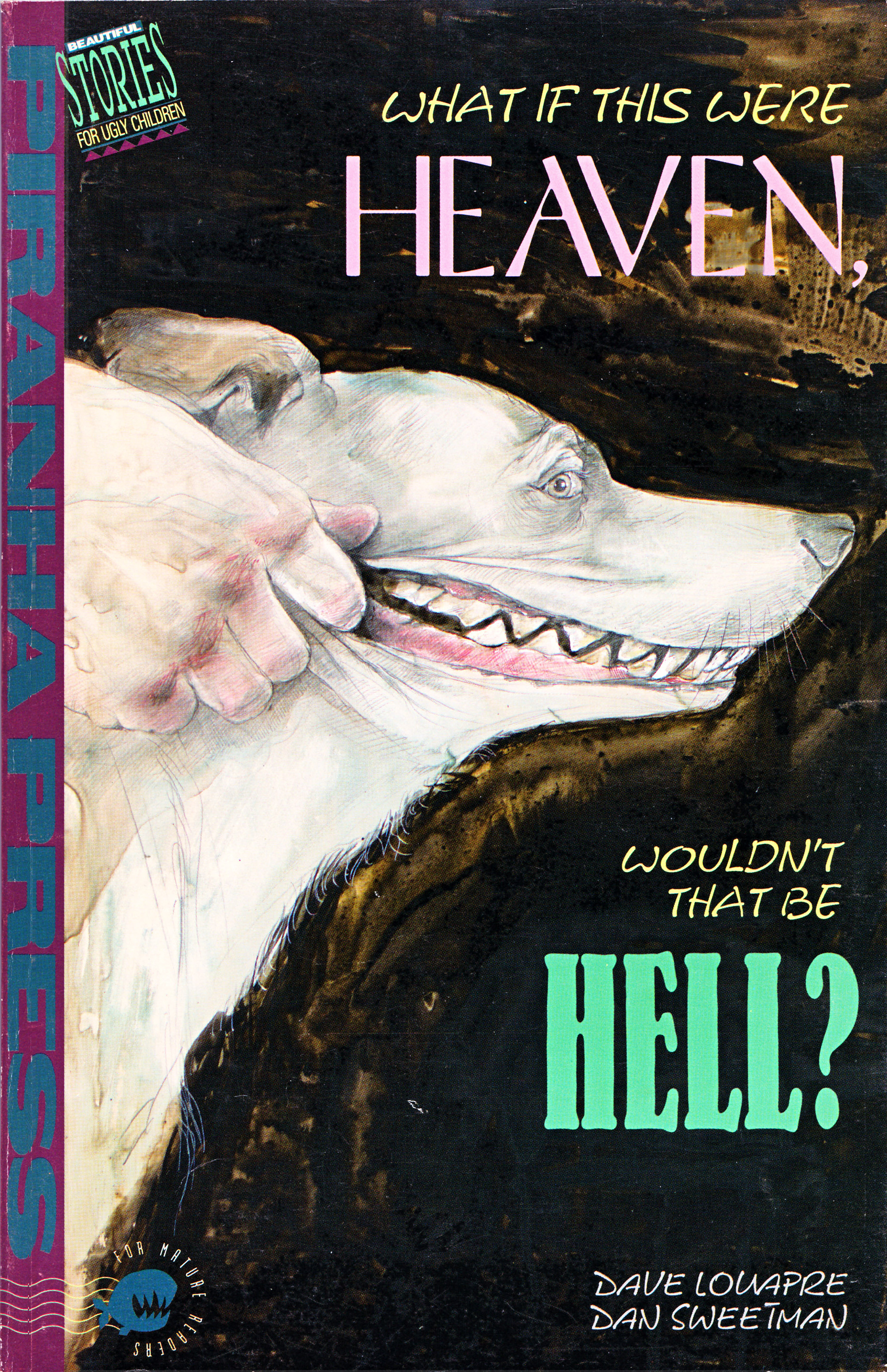
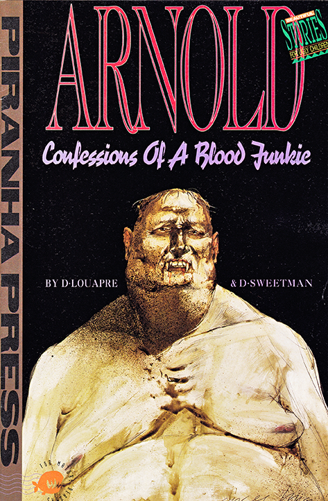
BEAUTIFUL STORIES FOR UGLY CHILDREN
Piranha Press/DC
This imprint put out items of great variety, some of them even good! ;-)
One of my personal faves, both to read and design, was BSFUC (see how YOU pronounce that!). They were more illustrated stories than comics but Piranha was wacky that way (other ways too, right, Mark?)
Dean Motter was the designer responsible for the trade dress, while I did the specific design for the covers and interiors of each volume.
All Hail Dave & Dan, wherever they are now.
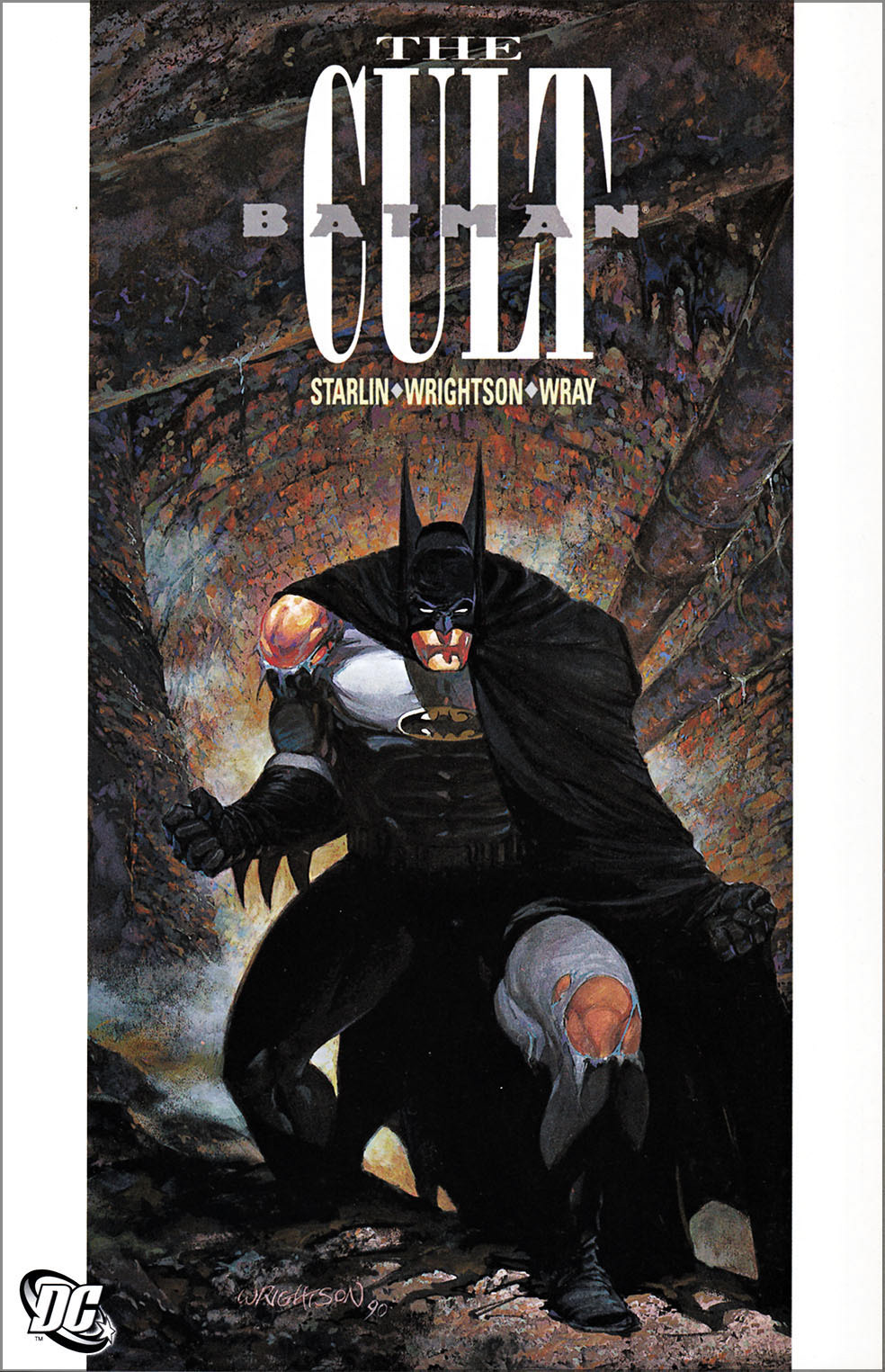
BATMAN: THE CULT
DC Comics
This book was interesting for a number of reasons, all more relevant to me than you, but whatever.
It was a book that I helped art direct on staff as DC's Design Director and then got it as a freelance assignment to design the next year after I left staff.
Artistically, it was a blast as I had my first real scanner and I was throwing everything I could find on the scanner bed and integrating those textural elements in my design work. This one was successful (least I thought so) due to the use of bold typography, white space and organic textures.
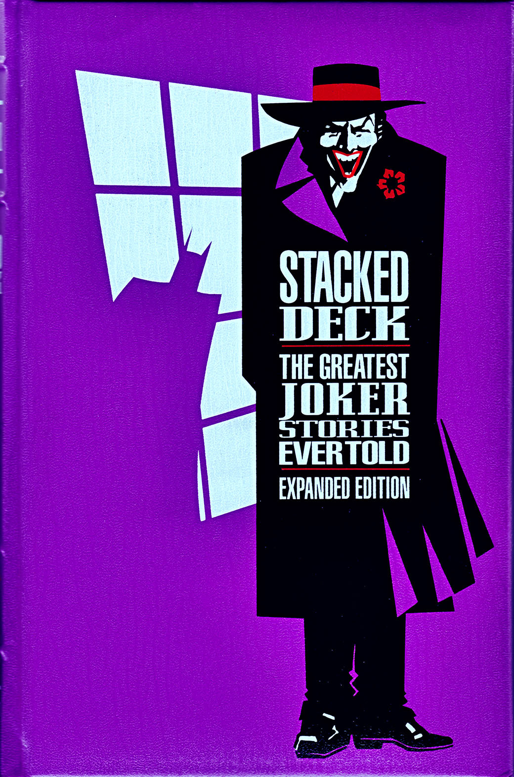
STACKED DECK
Longmeadow Press
Illustration by Dean Motter, design by me
I always liked the mix of type. And it is kerned and spaced to within a micron of its life.
It was a high-end hardcover (with gilt edges and a ribbon and fancy endpapers, etc). Had a lot of fun doing the interiors too but they're too much of a hassle to scan given the book's rigidity.
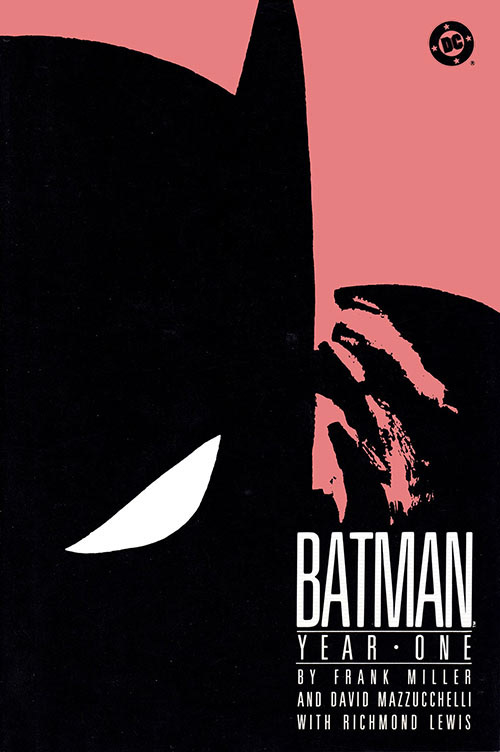
BATMAN: YEAR ONE
DC Comics
Ah, what some (including me) say might be one of the best comic stories ever. Lean, powerful writing by Frank, masterful art & storytelling by David and Richmond's extraodinary color palette. Cover and interior design by Janice Walker and myself. If you haven't read it yet, well, correct that error!
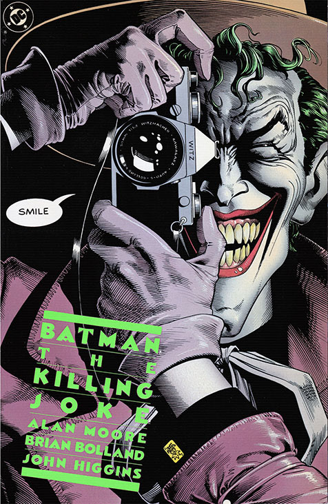
BATMAN: THE KILLING JOKE
DC Comics
What can I say? An all-time favorite. The design came to me in a "vision" on my way to work (way back in that day). And the color to do it in? DayGlo Lime Green, yes! Later, as we needed to go back to press (high demand - go figure) Marketing wanted to signify each separate printing (who cares!) by changing the color of the logo/type block. Well, you can pretty quickly go thru appropriate DayGlo printing ink colors. The original green remains my fave.
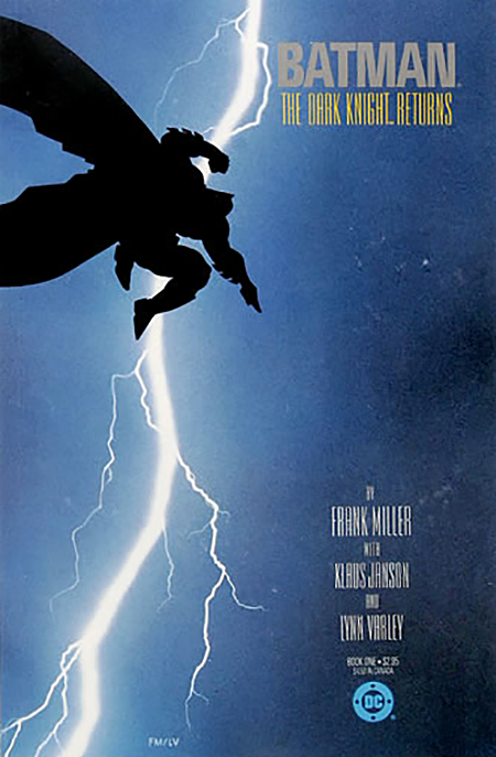
THE DARK KNIGHT RETURNS
DC Comics
Well, this became one of the most iconic covers in comics. Working with Frank, Klaus and Lynn was a blast. May not look so special now but it broke a lot of ground at the time.
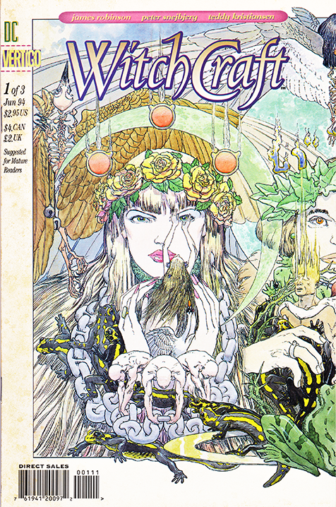
WITCHCRAFT 1 (of 3)
Vertigo
This was an interesting challenge as the goal was to do a triptych image that would could be split apart and also interlock the 3 issue covers (of the miniseries) together.
Always a joy to work with, Mike Kaluta knocked the art out of the park, as always.
Happy with how the logo turned out too but I'd probably simplify the "W" if I were doing it today.
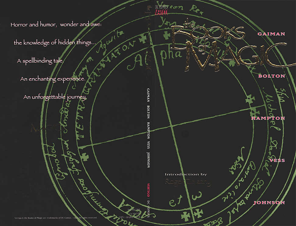
THE BOOKS OF MAGIC
Vertigo
A collection of the original prestige format series created by the talented Mr. Gaiman.
Somehow I convinced them to let me do the whole thing as a design, without the usual cover art. Hard to see the Gold embossed logo, but it turned out great, I'm happy to say.
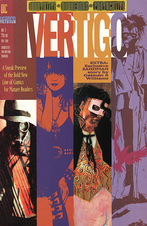
VERTIGO PREVIEW
The sampler book that started it all off. It's a golden oldie and one of my personal faves.